packaging, naming e identidad visual Innovadora de la cerveza musa
La musa
Where inspiration becomes beer
Read more +
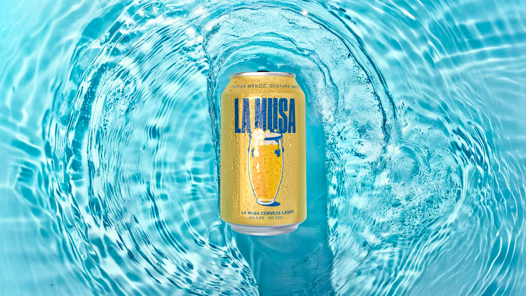
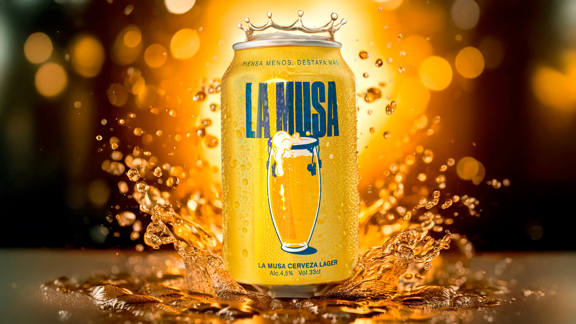
At the heart of this project beats the vibrant pulse of percussion, a passion the client wanted to transform into a unique beer experience. This is how La Musawas born, a a craft lager with a creative packaging design that merges the rhythm of music with the pleasure of a well-crafted drink. Inspired by the rhythmic strength of the timbal, its name evokes creativity, energy and the artistic flow that defines percussion, connecting the essence of the beer with inspiration, rhythm and the vibrant energy of live music.
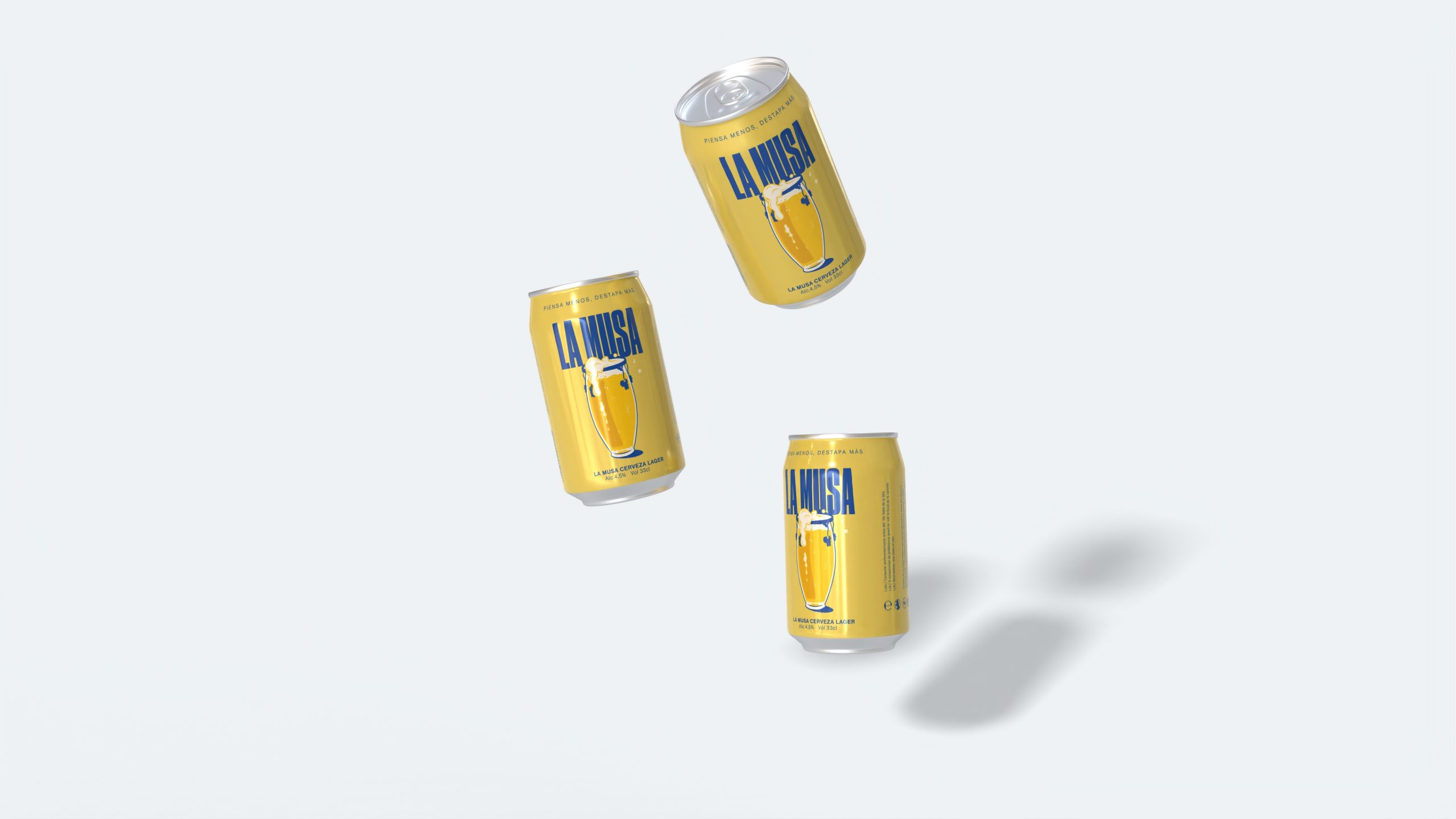
The Musa’s beer branding stands out through its innovative visual identity. The packaging design the timbal at the center, reinterpreted as a foamy beer muga visual metaphor that connects music and celebration. With a combination of vibrant and contrasting colors, the design captures the essence of percussive music and ensures that La Musa stands out in any setting, from an intimate gathering to an unforgettable party.
More than just a beer, La Musa is a multisensory experience that pays tribute to the art of percussion. Every element, from the strategic naming to the label design, is crafted so the consumer not only enjoys the flavor, but also feels the rhythm and passion of music in every sip.
The muse is calling,
are you ready for the toast?